Visualizing the Monty Hall Problem
The Monty Hall Problem is a great example of why our intuitions cannot be trusted when it comes to probability. If you are not familiar with the problem, the wikipedia link above gives a good description of the problem and it’s historical significance. There are examples of Ph.D’s not getting it, it’s just counterintuitive.
If you are still not sure why switching is the better strategy, I have made the following diagram that visualizes all of the possible outcomes and their probabilites. The tree flows from left to right, with blue numbers on the edges whenever the event pointed to has that probability. The probabilities multiply, and on the right side of the graph, all of those nodes sum to 1, meaning that they exhaust all possibilities. Here is the diagram for the strategy of staying on your original pick every time:
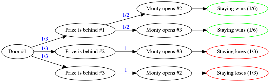
Notice that staying wins 1/3 of the time, and loses 2/3 of the time.
Note: because initially, there are three equally likely possibilities, it suffices to only analyze choosing door #1. Once we start playing, that’s when the probabilities start to get non-uniform.
Now, here is the analogous diagram for the strategy of switching to the other door every time:
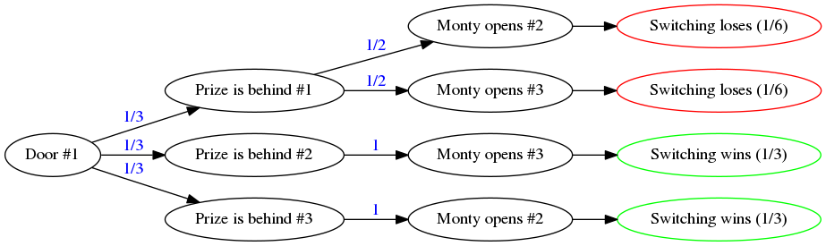
Notice that switching wins 2/3 of the time, and loses 1/3 of the time.
By simply visualizing the whole space of possibilities and keeping track of the conditional probabilities (those numbers on the edges), we can get the right answer. This also works in less contrived situations where we need to make an informed decision.